Design
Your event banner is more than decoration, it’s communication. It speaks for your brand,
announces your theme, and sets the tone before anyone even walks in. But before you hit
the print button, here are a few crucial details you should always double-check.
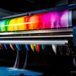
- Image & Design Resolution
Avoid grainy banners. Use images and logos that are at least 150–300 DPI (dots per inch).
Design in CMYK colour mode for print accuracy and never stretch low-res logos just to fill
space.
- Banner Size and Scale
Whether it’s a 6ft roll-up stand or a 12ft stage backdrop, always design in actual
dimensions. Scaling a design after creation may ruin the layout and quality.
- Font Legibility
Choose clean, bold fonts and prioritize clarity over style. Use sans-serif fonts like
Montserrat, Poppins, or Roboto and ensure high contrast.
- Bleeds, Margins & Safe Zones
Include a bleed margin of at least 0.5 inches and keep key elements within safe zones to
avoid trimming errors.
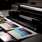
- Material & Finishing Choice
Select materials based on the event location. Outdoor: PVC flex or tarpaulin. Indoor: fabric,
mesh, or canvas. Add finishing like eyelets or lamination for durability.
A little planning goes a long way. At Print Effect, we offer free design consultation to ensure
your event banners come out perfect every time.
Need help with your banner design? Let’s talk today!